Showing posts with label interiors. Show all posts

Monday, 29 July 2013

DIY - a rather ugly table gets an update

This little desk found its way to me through fortunate coincidence.  I was looking for a desk for my study and had trawled eBay, stalked Freecycle but all to no avail.  Mr E & I were driving past our local church when I noticed a furniture sale, I persuaded him to stop and let me have a little look and there it was.  Unloved, an ugly colour but the right size, a pretty shape and only £15.  


I had hoped that I'd be able to strip off the original varnish and restore the wood, however after a vigorous afternoon spent with Nitromorse and steel wool it seemed that the wood underneath wasn't up to much.  Painting it was then.  I didn't really fancy stripping off the rest of the varnish so decided to try chalk paint.  It alleged that you could paint over anything - no need to sand, no need to undercoat.


I had read so many rave reviews of the paint that I was expecting to fall in love with it instantly.  To be honest I didn't really like it that much.  It was super thick and rather like painting with cream cheese.  Still it did the job! It's a little more shabby chic than I was hoping for but all in all I am pretty pleased.

I changed the handles for some Laura Ashley glass ones that I picked up in the charity shop and lined the drawers with some scented papers.


I've added a rather fetching pen pot and letter rack and it all looks lovely.

Tuesday, 23 April 2013

Going for gold...

Lately I seem to have an obsession with all things gold.  I lust after gilt and all it covers.  I also rather like geodes and quartz.  Whilst poking around the charity shops I found a lovely blue stone that made its way home with me.

I had a spare 5 minutes this evening and decided to give my stone a little touch of glamour.  It was a very quick DIY project, so quick in fact it barely counts as a project.  Tape off the areas that you don't want to colour and then get spraying.  I gave this two coats and it has covered fairly well.  I'm not totally enamored with the gold, it doesn't seem gold enough.  I might try to add some gold leaf to it another day but for now it looks slightly lunar and I'm happy enough.


Sunday, 27 January 2013

Decisions, decisions...

One of the exciting things about our new house is the chance to redecorate. Every room needs the existing wallpaper stripping, holes filling, electrics moving, ceilings plastering...the list goes on.  Me and Mr E are muddling our way through things - he on the practical side of things and me on the more decorative.  Most conversations are along the following lines:

Me:  What do you think of this bedside lamp?
Mr E:  What, for the bedroom that still needs stripping, plastering, painting, furnishing etc?

You get the picture.  For me I need to have an idea in my head about what the room will look like when it's finished in order to get through the layers of paint, paper, paint and more paper that require stripping from every surface. For Mr E he can't think about the finished room until all of that is done and we have a blank canvas ready.

All of this goes someway to explaining why we currently have four wallpaper samples stuck to our bedroom wall as I try to decide which one I like best for a room that is not going to be ready to decorate  until July!


They are all William Morris prints and at the moment I am leaning towards the two on either end but who knows, by the time we are ready for the actual decorating I may have changed my mind!

Monday, 28 May 2012

A little glamour...

I fell in love with this lamp back in March last year when I saw it on Liberty London Girl's blog.  I love the unashamed glamour and the nod to a more decadent and luxurious time.  I can't decide if it is Deco, or more 50s Hollywood inspired, but either way I am smitten.


Our last bedroom only allowed us one bedside table so imagine my joy when in our new home I was able to have my very own nightstand.  As soon as we were settled in I decided to track it down.  It is now on sale which makes it even better.  I decided to change the shade and bought a beautiful white, gold lined one at the same time.

Here it is in situ, what do you think...?


Monday, 20 February 2012

Colour crush...

I've been home alone this weekend and have had rather a lot of free time to devote to blog browsing!  I have discovered some super new interiors blogs and have been enviously drooling over other people's beautiful homes.  

Consequently I have become rather obsessed with the combination of coral and turquoise.  I love how the colours totally clash yet totally complement each other.

image from here

image from here

image from here

These rooms use the colours in their most vibrant and I think that they look just incredible.  I love how the traditional wood panelling lends itself so perfectly to the dark turquoise then meets the unexpected coral ceiling, rather like a sunset falling into the sea.

image from here

This room uses the same colours but in more muted, romantic tones.  It has a wonderfully elegant and calm feel and I rather think I would enjoy siting at that table with a cup of freshly brewed coffee.

image from here

If you aren't feeling brave enough to dedicate a whole room to these colours then this simple flower arrangement is an easy way to flirt with the idea until you are ready to commit!

image from here

The handwoven rug above is just too beautiful for words.  If this were in my home I think I would be to in awe to even step on it.

Monday, 16 January 2012

Blue Monday...

All this talk of houses, selling and renting and eventually buying has started me thinking about how I want our home to look.  I have a scrap book that I stick ideas in and hope that one day they will leave the pages and become part of a living house.

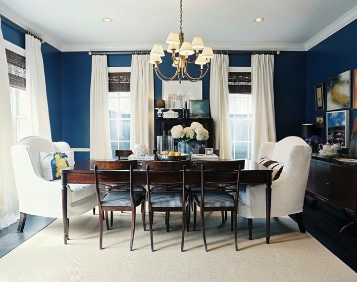
My latest fascination is navy blue.  Striking and elegant I think that I would like to use it somewhere.  It looks amazing when contrasted with bright white so perhaps a bathroom.  Or maybe a bedroom with some beautiful crisp bed linen.  Who knows...?!


image one from here
image two from here
image three from here

Wednesday, 2 November 2011

Poirot and Eltham Palace...

This evening I watched the ITV adaptation of Three Act Tragedy and swooned at the amazing home of Sir Charles Cartwright.  The most perfect Art Deco building, swooping white curves, decadent interiors and incredible furniture.

The more they showed of the inside the more convinced I was that I recognised the building.  The next scene was in an unmistakable panelled dining room and it came to me: Eltham Palace.  I visited the palace years ago on an English Heritage open day and instantly fell in love with the architecture, design and stunning rooms.  A medieval palace with an ultra modern private house built on the side, Eltham Palace makes a wonderful day out.  The same building was used in another Poirot as the home of Lynette Ridgeway in Death on the Nile.

A different building was used for the exterior of the house and after a bit of searching I found it.  St Ann's Court in Chertsey.  It is a Grade 2 listed building that as far as I can tell is a private home.  Such a shame as I would love to visit that one too.


Wednesday, 4 May 2011

And it was all yellow...

The sun is shining again today and I find myself in a cheery mood once more.  It would be lovely to bring some sunshine inside and what better way than with a splash of yellow?


There seem to be lots of different ways to use yellow and indeed lots of different yellows to use. Personally I like the super bright acid tones that are around at the moment and think that they are a great way to add a modern touch to your room.


I don't know if I would be brave enough to go all out and have an entirely yellow room myself but these do look amazing!


image one from here
image two from here
image three from here
image four from here

Wednesday, 6 April 2011

Totally teal...

I often sit and dream about what colours I will decorate my new house.  I don't have a new house by the way, nor am I even close to having one, but when I do at least I'll know what colour I want to paint my rooms.


My latest obsession is teal.  So called I understand after the Common Teal, a member of the duck family whose eyes are surrounded by the colour.  


I love the way that it be used as an all over colour or just an accent in a room.  It looks amazing when set off with crisp white wood work, or totally clashing with other brights.  It manages to be both vintage and modern at the same time and works in any room.


Wednesday, 16 March 2011

Grey skies...

It appears that the fleeting sunshine we were treated to at the weekend has abandoned us and has been replaced with grey skies and a light drizzle.

Fortunately, as I live in a country where grey skies seem to preside over much of the year, I actually really like grey.  I think that it is a very elegant, understated colour.  My bedroom at home is a selection of greys and I am drawn to other interiors that use it.  It works well with so many other colours and provides the perfect base for brighter accents or patterns.

In no particular order here are a few of my favourite grey things today...


image 1 from here
image 2 from here
image 3 from here